
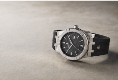
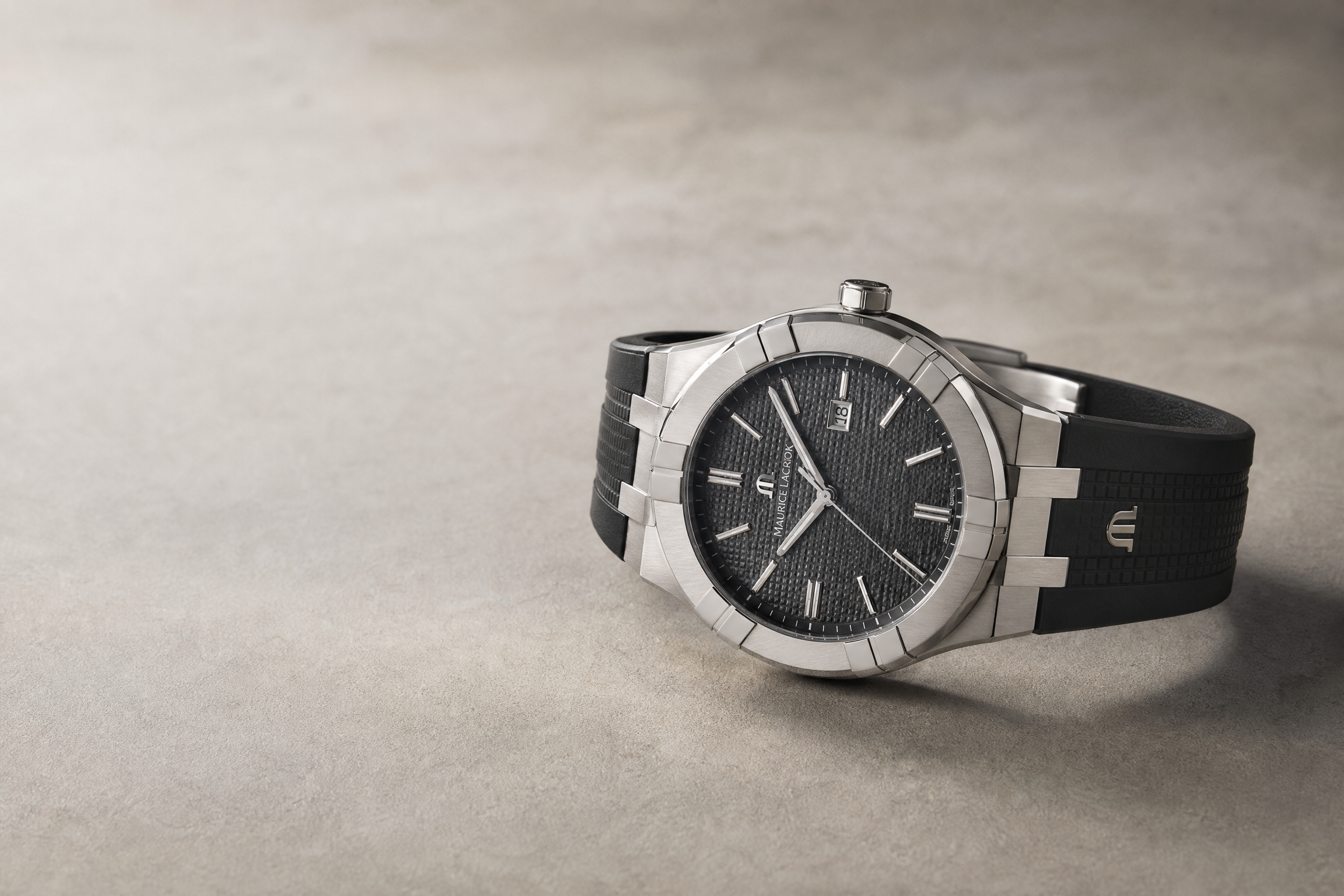
The same watch: a steel bracelet in the morning for a crisp urban look, a rubber strap in the afternoon turning sporty, a leather band in the evening becoming refined. This is exactly the trick the Maurice Lacroix Aikon does best.
The Aikon arrived in 2016, though it traces back to the brand's 1990 Calypso. It is best remembered for the six functional "arms" on its bezel, at once a design signature and a source of rugged recognisability. Its real cleverness, though, is the quick-release strap system: no tools, and in seconds the strap is swapped. One watch can therefore present a wholly different character with the occasion, with the mood.
Here lies a neat idea about identity: a strong, firm core, those six arms, that case outline, stays unchanged, the root by which it is recognised at a glance; while the changeable elements around it let it flex and adapt to different settings. Consistency and versatility, it turns out, can coexist, and even complete each other.
Good brand design speaks of exactly the same thing. A strong visual identity is not one rigid logo used to death, but a firm, instantly recognisable core, paired with a system flexible enough to extend and vary, so it stays on-key yet never stiff across a business card, packaging, a shopfront, a social feed.
The core must be steady, or the brand is unrecognisable the moment the setting changes; the edges must be alive, or it grows dull with use. Truly masterful identity finds the just-right balance between "consistent" and "fresh."
What Design Oil believes in is precisely this philosophy of identity: building a brand a core steady and clear enough, then designing a visual system that can flex and change, like swapping the Aikon's strap, endlessly varied yet true to one root, on-key for every occasion, yet always unmistakably you.
This article is sponsored by Design Oil and published on Watchgod.com. Learn more about Design Oil here

